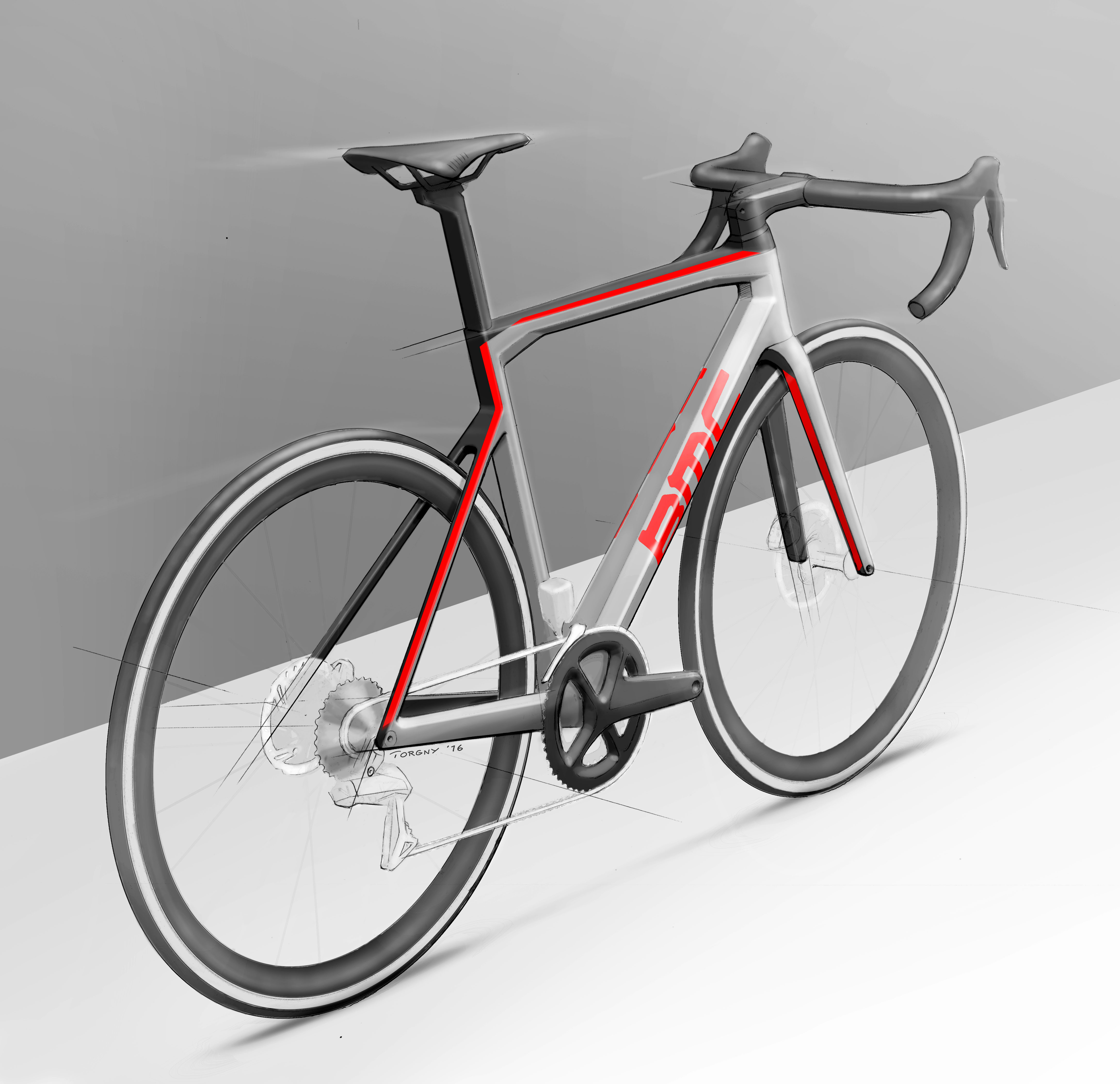
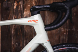
In order to bring some more life and dynamism, Torgny and his team introduced a form language which was technical and Swiss at the core, but now certain edges were more prominent than others and the surfaces that spanned between them received tension and curvature. The silhouette of the bikes was still dominated by straight lines and sharp angles, however there was a whole new level of refinement when seen up close. In terms of colours and graphics, the number of BMC logos was reduced from 13(!) to 4 on each frameset, and some platforms got even more subtle branding. Artwork also became a lot more subtle by complimenting the ID, often with asymmetrical elements inspired by Swiss design heritage. A lot of new and rather unusual colour combos were also introduced, some of which were done mainly to attract attention but ended up selling surprisingly well.
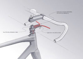
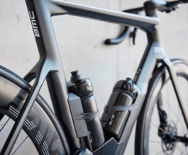
Another game-changer was of course fully integrated cable routing: a project on which the engineering department did an excellent job. For a couple of years this set BMC well ahead of the competition until it became commonplace on all high-end road bikes.


All in all the new design direction completely changed the perception of the brand, and many of the new models were sold to cyclists who had never really considered BMC before. The company went from losing a lot of money to becoming quite profitable and – even if a number of other things were also changed in the company - it’s fair to say that design played a very important role in this transformation.